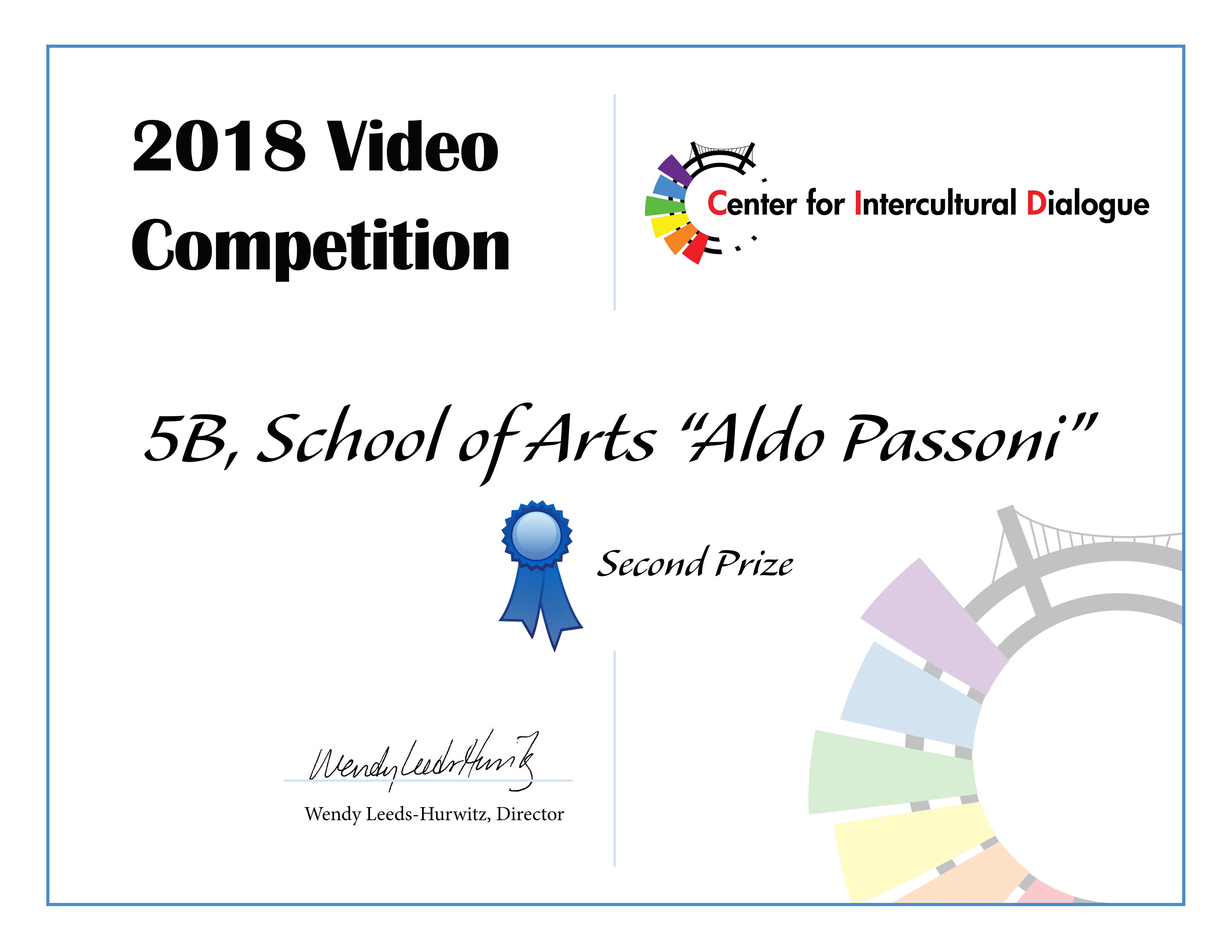
ECCO I GIUDIZI DELLA GIURIA:
Very creative and love seeing all the variety of cultures speaking about concepts that are universal. Would give award for originality.
· I liked this one a lot. It’s very professionally done, but that can be a disadvantage, as well. This video is almost like a Benetton advertisement, tries to collect all aspects of “intercultural” (faces, skin colors, languages, types, colors, etc.) Less would have been more in this case. I liked the last pun (after the end credits). I recommend a special prize for the most professional or maybe the most complex film.
· Yes – this one needs to be in the running. It was beautifully shot and the music and the message and the use of color with the text and the banners was great. It was simple and to the point – and I liked it very much. Love the ending…
· This was a good idea. The use of words and color was unique. However, it could have been made even clearer by the use of the same word, with different colors to represent the different nationalities. I didn’t really follow how the words fit together, or why the specific colors were chosen to depict each word. Also, the colors didn’t show up consistently on the kids’ faces.
· I liked the concept, not sure they got the idea across, though.
